Overview / TLDR
I have a hobby playing records at dance events. I needed a promotional site that I could direct people to which would have all my relevant information and media. The requirements were:
- A page of social media links
- A page of general info
- A page of upcoming and past events
- The ability to host large audio files (50-80MB)
- The ability to play the audio files on the site, without allowing hotlinking from elsewhere
- Minimal maintenance
In the past, I probably would have used something like Wordpress on a VPS for this. Both VPSes and Wordpress both require regular maintenance and updates to keep them patched to harden them to attackers. A VPS also costs money.
For this site, the content won’t change very often, and it’s read-only content so it doesn’t need a database or the ability to do request processing. Similar to this site, static files felt like the right path forward. Plus, render.com allows for free hosting of a limited number of static sites.
The plan was:
- Create the site using Jekyll
- Deploy the site to render.com
- Host the large audio files on AWS S3
- Use native HTML5 multimedia capabilities to play audio
Bootstrapping
There are literally hundreds of static-site generators. I’m not even sure if Jekyll is being actively maintained, but since it’s only used on the development side and the output is static content, I’m OK using deprecated-yet-familiar code. (If you want something actively maintained, I hear BridgetownRB is pretty good ;))
Jekyll
I use the standard jekyll setup process. I brought some configs and boilerplate over from another site to expedite the work. Nothing fancy.
For layouts, I like to create a bare layout file and then build others off of that. This ensures that my HTML head and general structure templating is universally consistent.
I considered doing Events as “Posts”, and may later decide to leverage that feature, but for right now I just want static files, so I created stub files about.md, index.html, events.md, demos.md and links.md.
Initial Redirects
For the time being, I don’t have root-level content, so I initially wanted it to always redirect to the Social Links page. In index.html:
1
2
3
4
5
6
7
8
9
10
<!doctype html>
  <head>
    <meta http-equiv="refresh" content="0;URL='events.html'" />
  </head>

  <body style="background-color: black">
    <a href="//events.html">For now, you'll be redirected here.</a>
  </body>
</html>
<% end %>
Very simple, classic meta-refresh HTTP redirect. Using this method let’s us avoid worrying about any kind of server-side request processing (where we typically do redirects now). The black background color reduces the flickering from the “flash of unstyleed content” (FOUC).
Event widgets
A month or so after those initial redirects, I added a “past events” section that shows a table of past bookings (with flyers, if possible). I also created a partial for both “upcoming” and “past” events that is rendered on the homepage and the “past events” page.
<figure class="event">
  {% if include.url %}
  <a href="{{ include.url }}" title="{{ include.title }}">
  {% endif %}
    {% if include.img %}
      <img src="{{ include.img }}" alt="event thumbnail" />
    {% else %}
      <img src="/assets/img/save-the-date.png" alt="event thumbnail" />
    {% endif %}
  {% if include.url %}
  </a>
  {% endif %}

  <figcaption>
        <a class="event-link" href="{{ include.url }}" title="More details for {{ include.title }}">{{ include.title }}</a>

      <p>{{ include.text }}</p>
      <time datetime="{{ include.datetime }}">{{ include.time }}</time>

  </figcaption>
</figure>
and then it’s used with:
<li>{% include upcoming_event.html
url="https://url.to/the/event"
img="/assets/img/events/YYYY-MM-DD-title.jpg"
title="The event title"
text="subtitle / location"
datetime="2023-01-01T12:00:00-04:00"
time="1 January 2023; 12p - 1pET" %}</li>
Design
I had previously designed signage and chosen a color scheme (sort of a synthwave / vaporwave vibe).
Since the sound aesthetic is Retro (we vinyl DJs aren’t very common anymore!), I wanted the visual aesthetic to reinforce that brand.
Stylesheet basis
I really, really like Tania Rascia’s Primitive UI boilerplate. It’s clean, basic, and easily extended. I’ve used it on several sites (including this one) so I have a good workflow built around it.
I modified the _variables.scss file to integrate my color choices:
1
2
3
4
5
6
7
8
9
10
11
12
13
14
$aquamarine: #8bd4e1 !default;
$magenta: #ed5ca1 !default;
$amethyst: #73499d !default;
$rich-black: rgba(3,3,3,0.8);

$background: url('/assets/img/background.jpg') no-repeat fixed black !default;
$primary-color: $aquamarine !default;
$secondary-color: $amethyst !default;
$accent-color: $magenta !default;
$alternate-background: $rich-black !default;
$alternate-color: $magenta !default;
$link-color: $magenta !default;
$link-hover-color: darken($link-color, 15%) !default;
$highlight: $aquamarine !default;
Typography
Google offers many web fonts for free. I found one called “Permanent Marker” that had the look I wanted.
I used a standard sans-serif font for the body copy.
Imagery
This happened over two iterations, but to reinforce the “retro” aesthetic of the brand, I knew that I wanted to incorporate a record sleeve (for the navigation background) and a cassette tape / case (for the navigation on the demos page).
Record sleeve

I used my scanner and scanned an actual record sleeve liner (White), then cropped and resized it in Photoshop. I placed it inside the <header> tag like this:
1
2
<header>
  <div id="record-sleeve">
and in the SCSS with:
1
2
3
4
5
6
7
8
9
10
11
12
13
14
15
16
17
18
19
header {
  #record-sleeve {
    display: flex;
    flex-direction: column;
    margin: 0;
    padding-top: 1rem;
    background: white;

    @include medium-breakpoint {
      position: fixed;
      height: 100%;
      right: -3rem;

      margin-top: 2rem;
      height: 100%;
      transform: rotate(3deg);

      background: url('/assets/img/record-sleeve.png') no-repeat;
    }
The transform: rotate(3deg) gave it a subtle angle that helped it stand more prominently and broke up the layout’s linearity, visually.
The individual links are written in $rich-black color using the “Permanent Marker” font. I applied CSS rotation to each one using nth-child() to make them seem more organic / hand-written.
1
2
3
4
5
6
7
8
9
10
11
12
13
14
15
16
17
18
19
20
21
22
23
24
25
26
27
28
29
30
31
32
33
34
35
36
37
38
39
40
41
42
43
44
45
46
47
48
49
50
51
52
53
ul {
  display: flex;
  flex-direction: row;
  list-style: none;
  margin: 20px 100px 0;
  padding: 0;
  flex-wrap: wrap;
  justify-content: space-between;
  column-gap: 1rem;

  @include medium-breakpoint {
    flex-direction: column;
  }

  li {
    font-family: 'Permanent Marker', cursive;
    display: inline;
    font-size: 3rem;

    a {
      color: $rich-black;
    }

    &.current {
      background-color: $rich-black;
      padding-left: 1rem;
      padding-right: 1rem;
      a {
        color: $primary-color;
      }
    }

    @include medium-breakpoint {
      margin-bottom: 1rem;
      &:nth-child(odd) {
        transform: rotate(4deg);
      }

      &:nth-child(even) {
        transform: rotate(-6deg);
      }

      &.current {
        a {
          color: $primary-color;
          text-shadow: -6px 4px 0 $rich-black,
                        6px 4px 0 $rich-black,
                        4px -4px 0 $rich-black;
        }
      }
    }
  }
}
I used flex-box to make them evenly spaced and more responsive. For “odd” items it tilts them slightly one way, and for “even” slightly the other way.
Given that I was anticipating people to get to the site via a QR code, I needed to ensure it was usable on mobile browsers. I added breakpoints to coerce the navigation to present in a stacked way at narrower breakpoints. (The record sleeve graphic is also hidden at smaller breakpoints).
Cassette case
The vision I had for the demos page was to have the list of individual demos resemble a stack of cassette tapes (back in the 90s and early 00s, we traded promos on cassette tapes). I scanned the spine of a cassette. It had a completely black background and I wanted it to have some transparency so it fit into the page more. In Photoshop, I carved the outline out and applied transparency to the background, then along the ends I applied a subtle gradient of transparency.
The SCSS for this section was initially:
1
2
3
4
5
6
7
8
9
10
11
12
13
14
15
16
17
18
19
20
21
  #mixtapes {
    li.tape {
      background: url('/assets/img/cassette-case.png') no-repeat;

      width: 588px;
      height: 75px;

      list-style: none;
      margin-bottom: 1px;

      @include large-breakpoint {
        &:nth-child(2n) {
          margin-left: 1rem;
        }
        &:nth-child(3n) {
          margin-left: -0.2rem;
        }
        &:nth-child(5n) {
          margin-left: 0.5rem;
        }
      }
The nth-child() lines cause the tapes to have a staggered effect and breaks up the visual linearity of the layout.
Cassette SVG
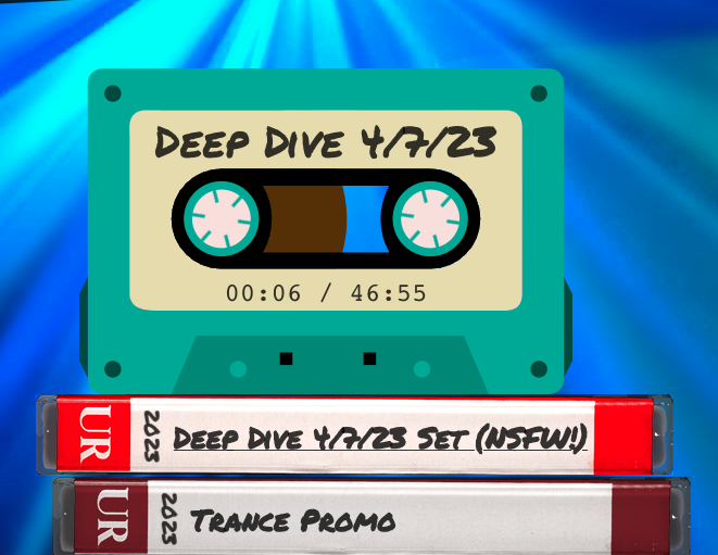
I had this idea to have a graphic of a cassette tape indicate the demo that was being played. I initially considered using a scan of a cassette, but I had these lofty ideas of some kind of cool animation, and that would be more difficult.
I found a CodePen demo of a cassette-SVG used for an audio player and lifted the SVG code from it. It seemed a bit verbose, and I wanted to tweak it slightly, so I imported it into Illustrator.
In Illustrator, I changed some of theh paths to add transparency so there was a transparent window in the center (to see the tape reels), then I placed two dark-brown circles on the bottom layer to be the tape reels, adjusted the overall size, and cropped it tight. After exporting, the resulting SVG was much more brief and cleaned up.
In the SVG code itself, I added a few classes to some of the <path> elements so that I can manipulate them with CSS. Initially I thought I could do it as a separate SVG file, but I had to inline it.
Two key parts here were the reels:
Note the “r” attribute, which is the “radius” of the circle. The class was attribute was added as a hook for Javascript to attach to later.
1
2
<circle cx="17.03" cy="18.03" r="5" style="fill: #513000;" class="left-reel" />
<circle cx="42" cy="18.03" r="5" style="fill: #513000;" class="right-reel" />
and the gears:
Here it was just the classes, left-gear and right-gear, which are used as hooks for the CSS.
1
2
3
4
5
6
7
8
9
10
11
12
<g class="left-gear">
  <path d="M15,15l4,6" style="stroke: #30a996; stroke-width: .4px;"/>
  <path d="M19,15l-4,6" style="stroke: #30a996; stroke-width: .4px;"/>
  <path d="M13,18h8" style="stroke: #30a996; stroke-width: .4px;"/>
  <circle cx="17" cy="18" r="2" style="fill: #f6dfda;"/>
</g>
<g class="right-gear">
  <path d="M44,15l-4,6" style="stroke: #30a996; stroke-width: .4px;"/>
  <path d="M40,15l4,6" style="stroke: #30a996; stroke-width: .4px;"/>
  <path d="M38,18h8" style="stroke: #30a996; stroke-width: .4px;"/>
  <circle cx="42" cy="18" r="2" style="fill: #f6dfda;"/>
</g>
The SCSS for the gears to animate theme spinning was also lifted from the CodePen, but I modified it slightly. The original code would add the animation if the .spin class was added to the gears (so hitting “play” would add the classes to the elements).
I modified it to instead spin by default, but not animate if the parent SVG has the class “pause” added to it.
I also added a desaturation effect to the cassette when it was “paused” and set the transition for that to give it a soft fade effect when activated. (The classes .plastic and .label are classes I assigned to a few of the parts of the cassette SVG so that it didn’t look flat universally when applied).
1
2
3
4
5
6
7
8
9
10
11
12
13
14
15
16
17
18
19
20
21
22
23
24
25
26
27
28
29
30
31
32
33
34
35
36
37
38
39
svg#svgCassette {
      width: 100%;
      height: 300px;
      display: block;

      .left-gear, .right-gear {
        transform-origin: center;
        transform-box: fill-box;
        animation: rotate-wheel 4s infinite linear;
      }

      path {
        transition: fill 1s;
      }

      &.pause {
        path {
          transition: fill 2s;
        }
        path.plastic {
          fill: desaturate(#30a996, 45%) !important;
        }
        path.label {
         fill: desaturate(#e3dcaa, 45%) !important;
        }

        .left-gear, .right-gear {
          animation: none;
        }
      }

      @keyframes rotate-wheel{
        from {
          transform: rotate(0deg);
        }
        to {
          transform: rotate(-360deg);
        }
      }
Polaroid photo
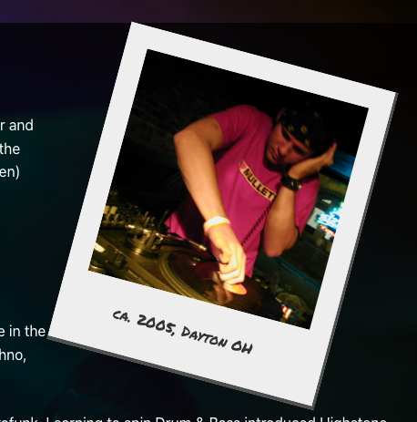
On the /about page, I wanted to have a photo inlay that had a Polaroid appearance. I used the <figure> tag as a wrapper for the image:
1
2
3
4
5
6
<figure class="polaroid pull-right tilted">
  <div class="frame">
    <img src="/assets/img/highstone-bio.jpg" alt="20-something DJ playing records" class="large" />
  </div>
  <figcaption>ca. 2005, Dayton OH</figcaption>
</figure>
MDN docs say, about the <figure> tag:
The
<figure>HTML element represents self-contained content, potentially with an optional caption, which is specified using the<figcaption>element. The figure, its caption, and its contents are referenced as a single unit.
and
Usually a
<figure>is an image, illustration, diagram, code snippet, etc., that is referenced in the main flow of a document, but that can be moved to another part of the document or to an appendix without affecting the main flow. A caption can be associated with the<figure>element by inserting a<figcaption>inside it (as the first or the last child). The first<figcaption>element found in the figure is presented as the figure’s caption.
The caption was important to me. I could have done the image only and applied a wide solid-white border to the edges, but since I wanted to also have a caption I knew I would need to wrap it, and the <figure> tag is the most semantically-appropriate for this use-case.
The SCSS looks like:
1
2
3
4
5
6
7
8
9
10
11
12
13
14
15
16
17
18
19
20
21
22
23
24
25
26
27
28
29
30
31
32
33
34
35
36
figure.polaroid {
  margin: 2rem;
  background-color: white;
  border-right: 3px solid rgba(6,6,6,0.7);
  border-bottom: 4px solid rgba(4,4,4,0.7);

  .frame {
    border: 1.5rem #EEE solid;
    padding-bottom: 0;
    overflow: hidden;
    width: 300px;
    height: 300px;

    img {
      height: 100%;
    }
  }

  figcaption {
    width: 300px;
    height: 3.5rem;
    background-color: #EEE;
    font-family: "Permanent Marker";
    text-align: center;
    color: $rich-black;
  }

  &.tilted {
    transform: rotate(15deg)
  }

  &.pull-right {
    float: right;
  }

}
Again, using the “Permanent Marker” font for brand consistency, and tilting it to break up the linearity and add more visual interest.
It’s right-aligned via float (At this point, using float feels almost archaic, but it’s the right thing to use in this case, for the behavior I wanted).
The photo is technically a landscape-oriented photo, and significantly larger, but it’s cropped with the overflow: hidden. It could have also been cropped in Photoshop, pre-emptively.
Hosted Media
Long ago, I used to host all my mixes on my website directly. Occasionally they would get hotlinked from elsewhere. While the traffic is nice, if they’re only consuming your audio, you’re basically a CDN and I’m not paying for that level of service.
What I wanted to do here was self-host the files so that I’m not beholden to another business’s constraints (if an individual artist / label wants to send me a DMCA takedown notice for one of theh tracks on a mix, so be it, but it’s less likely if it’s not on a big website). Also self-hosting is cheaper and avoids having to deal with other people pre-rolling ads.
AWS S3 configuration
AWS S3 storage is cheap and easy, and it allows for some more complicated configurations that prevent hotlinking. So I wrote this bucket policy for the S3 bucket.
{
    "Version": "2012-10-17",
    "Statement": [
        {
            "Effect": "Allow",
            "Principal": "*",
            "Action": "s3:GetObject",
            "Resource": "arn:aws:s3:::djhighstone/*",
            "Condition": {
                "StringLike": {
                    "aws:Referer": [
                        "http://www.djhighstone.com/*",
                        "http://djhighstone.com/*",
                        "https://www.djhighstone.com/*",
                        "https://djhighstone.com/*"
                    ]
                }
            }
        }
    ]
}
Superficially, what this does is ensure that any requests to any of my media files originates from my website domain. Obviously this isn’t foolproof and it’s still technically possible to spoof that. If someone wants to go through all that trouble to do it, well that’s just fine.
One gotcha with S3 is that it defaults to very limited permissions for any uploaded file, so after uploading a file, you have to set it’s permissions to make it publicly accessible.
Deployment
Having built this site with Jekyll, the deployment process with render is well-documented and straightforward.
Next Steps
The next thing I want to add to this is the ability to jump forward / backwards to pre-determined timestamps for each mix (so that it works better as a demo), and to add playlists that display while the mix plays.